Helvetica No More
Eliza Nguyen
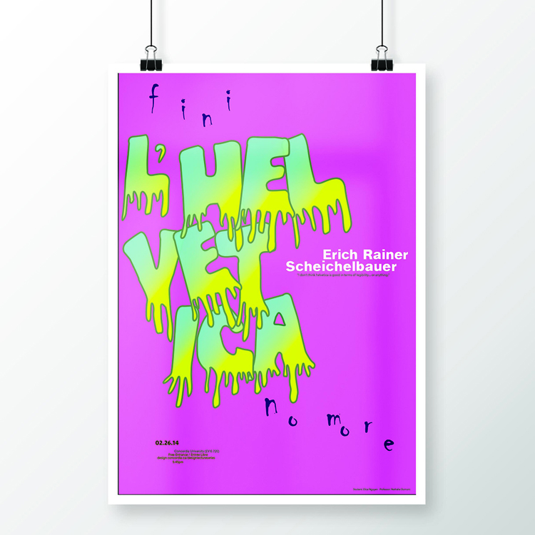
The Design department hosted a talk at Concordia on why Helvetica may not be such a great typeface after all. The keynote speaker was Erich Rainer Scheichelbauer who hails from Vienna. He spoke about his love for typography and his disdain for Helvetica. The custom vector typeface for “Helvetica” in the poster serves as a fun and playful means to contrast the neutrality of the Helvetica typeface. It also serves as a way to showcase the “melting” and “disintegration” of the typeface. The colours are bold and vibrant to grab the attention of the viewer and reinforce the idea of making a statement.
Paper
24 x 36 in.